One of those old comforts AngularJS provided was its use in block label templates. (Although, I suppose, if it was that comfortable would I have needed to build a cheatsheet?)
Umbraco Flavored Markdown: A ${template} for success
- Tagged with:
- Backoffice
- v14
- v15
- v16
- v17
What are block label templates?
All blocks, including those inline in the RTE, block grid or, as shown here, in the block list will by default show the name of the block's type. Which is not the most helpful if you're trying to find a specific block in a list of 5 of the same type... so block label templates came to the rescue!
These templates would allow us to pull values out of the block's content or settings and render the name of a page using the ncNodeName filter: Call to Action: {{ page | ncNodeName }}
Or strip markup from an RTE, and truncate it to fit the label: Text module: {{ bodyText.markup | ncRichText | truncate:true:35 }}
But with the removal of AngularJS, came the removal of AngularJS templates...
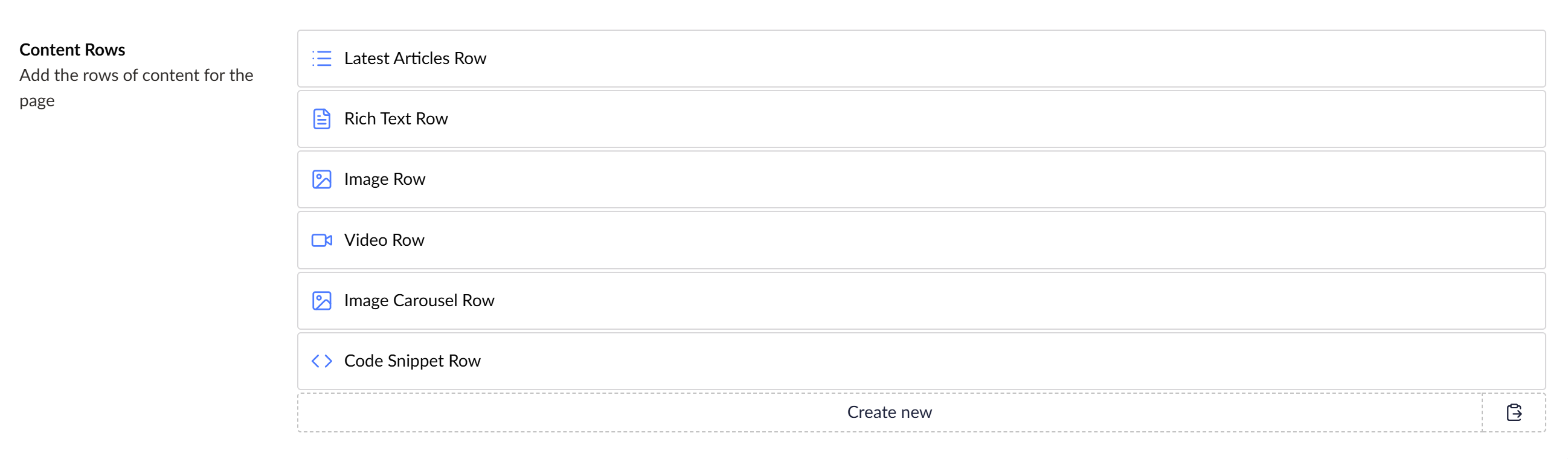
All blocks, including those inline in the RTE or, as shown here, in the block list will by default show the name of the block type.
Umbraco Flavored Markdown (UFM)
This is where UFM comes in. UFM stands for Umbraco Flavored Markdown (although the "Markdown" bit is largely irrelevant for labels! But UFM is used more globally in Umbraco - it’s what's used in property descriptions too!)
There are several syntaxes for using UFM: components ({componentAlias:value}), expressions (${ jsLikeSyntax }) and filters appended to these components or expressions (| filterAlias:parameters). Let's explore each of these in more detail.
UFM Components
Components are the original UFM syntax and offer shortcuts for some common use-cases for rendering labels.
Component Use Example umbValuerender the value of a property {umbValue: heading}umbContentNameget the name(s) of picked content {umbContentName: blogCategory}umbLinkget the title of a picked link {umbLink: callToAction}umbLocalizelocalize a dictionary string {umbLocalize: contact_us}
Although more limited than Expressions components are (currently) the only method of obtaining content names and localization keys in label templates.
UFM Expressions
Expressions are a closer parallel to the AngularJS templates we had previously. You can run simple, safe JavaScript-like expressions to obtain values. The expressions have access to all property values as well as any block settings on a $settings variable and the block’s index in $index (0-based unlike in Angular where it was 1-based) as well as native, non-global JavaScript functions.
${ $index+1 }. Rich Text: ${ content } ${ $settings.hide == '1' ? '[HIDDEN]' : '' }
UFM Filters
Another parallel to AngularJS is the concept of Filters. These are piped onto the end of an existing component or expression to further modify the value.
Filter Parameters Use wordLimitnumber of words limits to a number of words truncatelength, suffix limits to a number of characters and appends a suffix ( …) if trunctatedstripHtml removes HTML markup leaving only the text uppercase converts text to UPPER CASE lowercase converts text to lower case titleCase converts text to Title Case fallbackfallback value taking a string parameter to show if the value would otherwise be null bytes formats a number of bytes as human-readable text in KB, MB, GB, etc.
At the time of writing, filters with parameters don’t work for expressions but an issue has been raised on GitHub.
The filters allow us to tidy up our example from earlier by stripping the HTML, truncating and providing a fallback.
${ $index+1 }. Rich Text: {umbValue: content | stripHtml | truncate:30 | fallback:[Empty] } ${ $settings.hide == '1' ? '[HIDDEN]' : '' }
UFM Examples
These are the templates I recently PR'd to the Clean Starter Kit, which take advantage of a lot of the features we talked about:
Rich Text: ${ content.markup | stripHtml } ${ $settings.hide == '1' ? '[HIDDEN]' : '' }
Image: ${ caption } ${ $settings.hide == '1' ? '[HIDDEN]' : '' }
Video: ${ caption != '' ? caption : videoUrl } ${ $settings.hide == '1' ? '[HIDDEN]' : '' }
Code Snippet: ${ title } ${ $settings.hide == '1' ? '[HIDDEN]' : '' }
Image Carousel ${ $settings.hide == '1' ? '[HIDDEN]' : '' }
{umbContentName:articleList} Articles ${ $settings.hide == '1' ? '[HIDDEN]' : '' }
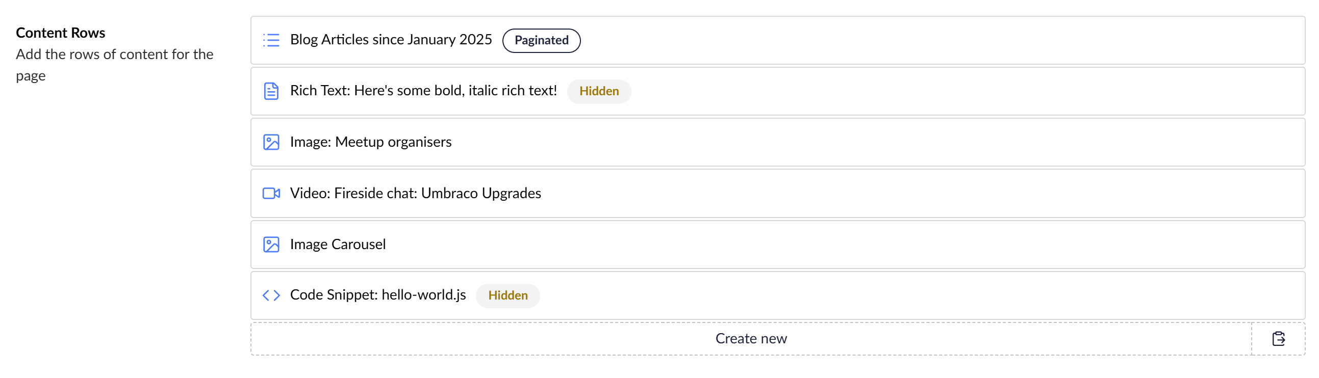
The default block labels used in Clean Starter Kit take advantage of a lot of the features we talked about
![The default block labels used in Clean Starter Kit are rendered out showing "Blog Articles", "Rich Text: Here's some bold, italic rich text! [Hidden]", "Image: Meetup organisers", "Video: Fireside chat: Umbraco Upgrades", "Image Carousel" and "Code Snipper: hello-world.js [HIDDEN]"](/media/v3fjsv0b/blocks-basic-templates.png?rnd=134084824836430000)
That's a lot clearer than showing the block type name!
Extending UFM
The difficulty with replacing something as complex as AngularJS templates is that they were so flexible it’s hard for Umbraco to know what people were doing with it and therefor what the new implementation needs to replicate - not every use case has been replicated.
The good news is that where features are missing, Umbraco have been responsive to feature requests and are implementing features rapidly. In even better news, we’ve been provided multiple mechanisms to extend UFM: custom components and custom filters.
Extending the Umbraco Backoffice
But first, to extend UFM we need to know how to extend the backoffice. This has changed significantly with v14+ and is geared up for packages, making one-off tweaks to sites harder to implement.
There are several options for starting out creating an extension:
The Umbraco docs guide to creating a Vite-based package which involved a lot of steps and deleting sample code, we wanted something quicker!
The
dotnet new umbraco-extensionUmbraco Extension dotnet template is so close to what we need, but at the moment contains an awful lot of extra files that you may or may not want.Lotte's Opinionated Umbraco Package Starter Template uses the dotnet template under the covers adding features fantastic for creating versioned, distributed packages but is overkill for our use case
Vanilla JS which although it’s simple and works really well for smaller extensions, I prefer the full TypeScript, Lit and Vite setup so it's easier to add larger extensions to a project without a second bottleneck.
And as we know in software development, when there are too many options, make another one! Bump's Umbraco Backoffice Extension Starter
should be a dotnet or NPM template but for now just a zip file that creates razor class library with Vite, TypeScript and Lit with just the basic config and no samples to delete.
Creating a custom UFM Filter
So let’s start by creating a custom UFM filter. The Bump Extension starter provides a manifests.ts file where we can register our extensions.
export const manifests: Array<UmbExtensionManifest> = [
  // Adding a custom UFM filter manifest in the existing manfests.ts file
  {
    // ufmFilter is the type to create a UFM Filter (from the list of possible extension types https://docs.umbraco.com/umbraco-cms/customizing/extending-overview/extension-types)
    type: 'ufmFilter',
    // This is the alias used by the Umbraco extenion system to identify the extension, it must be unique
    alias: 'My.UfmFilter.DateFormat',
    // The name of the filter
    name: 'Date Format UFM Filter',
    // Tell it what code to run (we'll look at this file below)
    api: () => import('./date-format.filter'),
    meta: {
      // And give the filter an alias for use in the markdown e.g. {umbValue: dateField | dateFormat}
      alias: 'dateFormat'
    }
  }
];
The Bump Extension starter provides a `manifests.ts` file where we can register our extensions.
The filter file referenced in the manifest is a TypeScript class extending UmbFilterBase, which has a filter function (taking the value as a parameter, as well as any parameters we want the filter to take) where we can transform the value. Here’s a simplified example of my dateFormat filter.
import { UmbUfmFilterBase } from '@umbraco-cms/backoffice/ufm';
import { DateTime } from 'luxon';

// Extending the UmbUfmFilterBase to create a custom UFM filter
class UmbUfmDateFormatFilterApi extends UmbUfmFilterBase {
  // The filter method is where the logic of the filter is implemented
  // It takes the value to be filtered and any additional arguments we want to pass, in this case, the date format
  filter(value, format) {
    if (!value) return value;

    // Using Luxon to parse and format the date in the specified format
    const date = value instanceof Date ?
      DateTime.fromJSDate(value) :
      typeof value === 'string' ?
        DateTime.fromISO(value) :
        DateTime.fromISO(value.date, { zone: value.timeZone || undefined });

    return date.toFormat(format || "yyyy-MM-dd HH:mm");
  }
}
export { UmbUfmDateFormatFilterApi as api };
The final version of this filter allows multiple different formats of date, implements some validation and adds TypeScript type descriptors, but this overcomplicated our example.
In this example, I have a block that allows me to filter articles newer than a specified date. I can now format the picked date as a human-readable value using my new filter:
{umbContentName:articleList} Articles${ dateFrom ? ' since ' : '' }{umbValue: dateFrom|dateFormat:MMMM yyyy} ${$settings.hide == '1' ? '[HIDDEN]' : ''}

As a human, I like my dates human-readable!
Creating a custom UFM Component
Taken from the Clean Starter Kit, you might have noticed the logic to show the word [HIDDEN] in all these templates. Wouldn't it be nice if we could make this feel more like a part of the UI with little tags?
![A screenshot of the templates from earlier but with the word “[Hidden]” removed and replaced with a wireframed tag UI element reading “Hidden”](/media/w3obzoyv/blocks-component-mockup.png?rnd=134084830864670000)
Wouldn't it be nice if we could make this feel more like a part of the UI with little tags, as beautifully demonstrated in my Microsoft Paint-generated mock-up?
To do that we're going to need a UFM Component as UFM filters can't return HTML (but also we've made a UFM filter so its only right we make a UFM Component too!) Here's our manifests file again but now we're adding a new manifest for a ufmComponent.
export const manifests: Array<UmbExtensionManifest> = [
  // Our ufmFilter manifest from earlier
  {
    type: 'ufmFilter',
    alias: 'My.UfmFilter.DateFormat',
    name: 'Date Format UFM Filter',
    api: () => import('./date-format.filter'),
    meta: {
      alias: 'dateFormat'
    }
  },
  // Adding a custom UFM component manifest in the existing manfests.ts file
  {
    // ufmComponent is the type to create a UFM Component (from the list of possible extension types https://docs.umbraco.com/umbraco-cms/customizing/extending-overview/extension-types)
    type: 'ufmComponent',
    // This is the alias used by the Umbraco extenion system to identify the extension, it must be unique
    alias: 'My.UfmComponent.Tag',
    // The name of the extension
    name: 'Tag UFM Component',
    // Tell it what code to run (we'll look at this file below)
    api: () => import('./tag.component'),
    meta: {
      // And give the component an alias for use in the markdown e.g. {tag: value}
      alias: 'tag'
    }
  }
];
Everything here looks very similar, but we’ve set an alias of tag.
Most UFM Components actually just render a custom web component, where most of the logic lives. Although I’m not 100% sure why this decision was made in Umbraco’s core (it certainly doesn't have to render a web component), using a web component does mean we can write asynchronous code which isn’t an option with the native UFM Component implementation.
That component file will look something like this:
import { Tokens } from '@umbraco-cms/backoffice/external/marked';
import { UmbUfmComponentBase } from '@umbraco-cms/backoffice/ufm';

// This reference is to the custom web component this UFM Component is going to render
import './tag.element';

/// Example usage: `{tag: hide:Hidden:warning:secondary}` where
/// `hide` is the name of a boolean property or setting property
/// `Hidden` is the text to display when true (or truthy)
/// `warning` is the UUI Tag color property (default, positive, warning, danger)
/// `secondary` is the UUI Tag look property (default, primary, secondary, outline, placeholder)

// Extending the UmbUfmComponentBase to create a custom UFM component
export class TagUfmComponentApi extends UmbUfmComponentBase {
	constructor() {
		super();

		this.render = this.render.bind(this);
	}

	// UmbUfmComponentBase expects a render method to be implemented that returns the HTML string to render
	// The token parameter contains the entire Markdown token
	render(token: Tokens.Generic) {
		if (!token.text) return;

		// UmbUfmComponentBase has a helper method to extract HTML attributes from the token text
		const attributes = this.getAttributes(token.text);

		// We're returning the markup for a custom web component here (yay, async!), passing in the attributes we extracted
		return `<ufm-my-tag ${attributes}></ufm-my-tag>`;
	}
}

export { TagUfmComponentApi as api };
In the full example, I actually override the getAttributes function in this case because I want my UFM Component to have additional parameters which is not natively supported by Umbraco:
	protected override getAttributes(text: string): string | null {
		if (!text) return null;

		const pipeIndex = text.indexOf('|');

		const left = text.substring(0, pipeIndex == -1 ? undefined: pipeIndex).trim();
		const filters = pipeIndex === -1 ? null : text.substring(pipeIndex + 1).trim();

		const parts = left.split(':');
		const alias = parts[0].trim();
		const display = parts[1]?.trim();
		const color = parts[2]?.trim();
		const look = parts[3]?.trim();

		return Object.entries({ alias, filters, display, color, look })
			.map(([key, value]) => (value ? `${key}="${value.trim()}"` : null))
			.join(' ');
	}
`getAttributes` gets more attributes
As for the web component the UFM Component is rendering, you might ordinarily extend UmbUfmElementBase which includes the properties we need and some filter-handling logic. Unfortunately, at the time of writing, when extending that class in TypeScript it prevents us from returning HTML template literals which I need for my example. Fortunately, we’re just rendering a web component here - the base class is not required. It does add the filter-handling logic, though. Luckily for us, filters don’t make sense to apply to this Component, so I’ve left that out, only needing to implement a couple of properties from the base:
import { customElement, property, state, html, css } from '@umbraco-cms/backoffice/external/lit';
import { UMB_UFM_RENDER_CONTEXT } from '@umbraco-cms/backoffice/ufm';
import { UmbLitElement } from '@umbraco-cms/backoffice/lit-element';

// This is the tag name of the custom web component, i.e. <ufm-my-tag>
@customElement('ufm-my-tag')

// Normally you might extend UmbUfmElementBase  which includes some filter logic (which this element just ignores anyway)
// but that class forces render to return a string rather than an HTML template
export class UmbUfmLabelValueElement extends UmbLitElement  {

  // These properties would ordinarily be provided by UmbUfmElementBase
  // These all get populated by the getAttributes method in the UFM Component
  @property()
  alias?: string;

  @property()
  display?: string;

  // These properties are the additional ones I overrode the getAttributes method to provide
  @property()
  color?: string;

  @property()
  look?: string;

  // This is a state property which tells Lit to re-render when it changes
  @state()
  show: Boolean;

  constructor() {
    super();

    // Set the default values
    this.show = false;

    // We observe the UFM render context, so when block values change our value updates
    this.consumeContext(UMB_UFM_RENDER_CONTEXT, (context) => {
      this.observe(
        context?.value,
        (value) => {
          // Pull out the value of the referenced property from the context
          if (this.alias !== undefined && value !== undefined && typeof value === 'object') {
            var obj = value as Record<string, unknown>;
            // I'm also making it work for settings, not just content!
            var settings = (obj["$settings"] as Record<string, unknown>) ?? {};

            // Ordinarily we'd set UmbUfmElementBase's this.value,
            // but I'm overriding the render function to do something a little different
            this.show = !!(obj[this.alias] || settings[this.alias]);
          } else {
            this.show = !!value;
          }
        },
        'observeValue',
      );
    });
  }

  // I'm overriding the render method to show or hide the tag based on a block value
  override render() {
    if (this.show) {
      // If I was returning a string, we could've used UmbUfmElementBase
      return html`<uui-tag color="${this.color}" look="${this.look}">${this.display}</uui-tag>`;
    }
    return null;
  }

  // Add some CSS using Lit's convention
  static styles = css`
    uui-tag {
      margin: 0 1ex;
    }
  `;
}

// Expose our element to JS
export { UmbUfmLabelValueElement as element };
declare global {
  interface HTMLElementTagNameMap {
    'ufm-my-tag': UmbUfmLabelValueElement;
  }
}
Which means we can replace this [HIDDEN] logic with our new component, replacing ${ $settings.hide == '1' ? '[HIDDEN]' : '' }with {tag: hide:Hidden:warning:secondary}.
My tag web component takes 4 parameters (I don’t think UFM Components were designed to take parameters like Filters do - sorry Umbraco!): the boolean property alias, the text to display if true and the tag colour & style (from the UUI component).
I’ve also added a flag that shows if we have pagination enabled for our blog posts by adding {tag: showPagination:Paginated:default:outline} to the label.
Hopefully these real-world examples of using and extending UFM ease some confusion around making these simple backoffice improvements in the modern Umbraco backoffice.
Things are changing quickly as people are stress-testing the new functionality, so my advice is to keep your ear to the ground (and I'll try to keep pace with the changes in my new UFM cheat sheet too!)
