
Web typography must adapt to countless devices, screen sizes, and user preferences
Overview
Fluid responsive typography is a complex topic, and this article is just an introduction.
Each section explains core concepts and may include further reading, example images, code snippets and a working web page so you can see the techniques in action.
Why Typography Matters
Refining typography to make text as easy to read as possible is a core aspect of User Experience Design, which itself is fundamental to good Web Design.
When we refine typography, we are principally concerned with these things:
- Font size – the size of the text itself.
- Line length – the number of characters per line, which affects readability.
- Line height – the space between lines, which influences visual comfort and rhythm.
Further Reading
The Equilateral Triangle of a Perfect Paragraph
By Matej Latin
A great article explaining the relationship between Font Size, Line Length and Line Height.
The Equilateral Triangle of a Perfect Paragraph - A web typography learning game
By Matej Latin
An interactive game that puts your typography skills knowledge to the test
Why Web Typography Isn't Like Print
Whilst the principles of good typography originate in print the web introduces unique challenges. Unlike print, where dimensions are fixed, web typography must adapt to countless devices, screen sizes, and user preferences.
Print Typography
- The width of the reading areas is fixed.
- Line length (number of characters per line) is determined by font size.
- Line height (space between lines) also depends on font size.
- Both vary with different typefaces.
Web Typography
- The width of the reading area is variable:
- Content is consumed on a wide variety of devices
- Screen sizes and resolutions differ significantly
- Font sizes can be changed by the user:
- Users can adjust font size in devices and browsers
- Users can adjust zoom in devices and browsers
- Even typefaces can be changed in the browser by the user
Whilst it's true the user can override our carefully crafted typography, our aim is to make it as usable as possible in the first place so they don't have to.
W3C Web Accessibility Initiative (WAI) make the following recommendations in relation to line length:
- Width is no more than 80 characters or glyphs (40 if CJK).
And in relation to zoom:
- Text can be resized without assistive technology up to 200 percent in a way that does not require the user to scroll horizontally to read a line of text on a full-screen window.
It is also worth noting recommendation for line spacing:
- Line spacing (leading) is at least space-and-a-half within paragraphs, and paragraph spacing is at least 1.5 times larger than the line spacing.
Further Reading
Optimal Line Length for Readability
By Andrew Martin
A deep dive into Line Length for web.
Success Criterion 1.4.8 Visual Presentation
By w3.org
Level AAA criteria for accessibility
Why Typefaces Matter
One might assume that if a font size is set by the web browser, usually a default of 16 pixels, that the line lengths would be consistent regardless of the typeface used.
However, different typefaces have different character widths, so the same font size can produce very different line lengths.
Let's use the following three common typefaces and create an example:
Courier New (Monospace)
Monospace fonts give every character the same width. This means narrow letters like “i” take up as much space as wide letters like “m,” notice how Courier produces the longest line compared to proportional fonts.
Georgia (Serif)
Georgia is a proportional serif font, so character widths vary. It’s designed for readability in body text, with slightly narrower letterforms than many sans-serif fonts.
Verdana (Sans-Serif)
Verdana is a proportional sans-serif font optimized for screens. Its characters are wider and more open, which can shorten line length compared to Georgia at the same size.
Example 1
Example 1 shows three paragraphs in each of the typefaces with no font size set so they use the browsers default font size (usually 16px).
If you click on the link and open Example 1 in a new browser window you will notice the following things:
- The line length differs between the typefaces
- If you resize the browser window the line length gets longer and shorter and the font size stays the same
- If you zoom in and out both the line length gets longer and shorter and the font size gets larger and smaller
This is the default behaviour of the web browser.
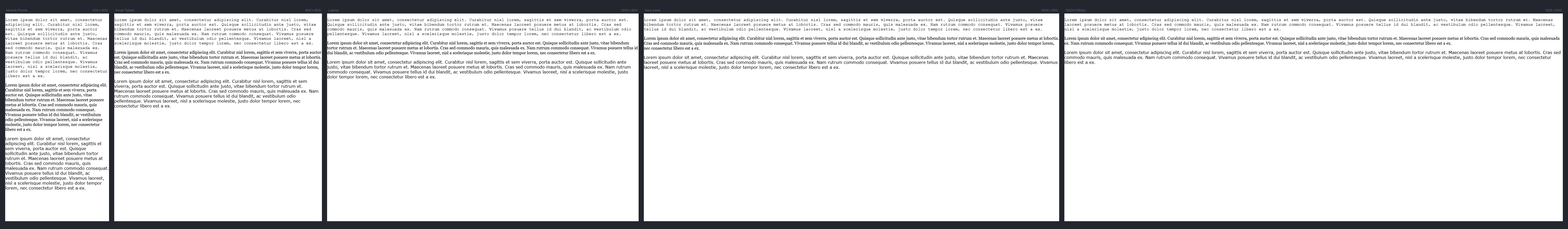
Image for Example 1
    .monospace {
      font-family: 'Courier New', Courier, monospace;
    }

    .serif {
      font-family: Georgia, 'Times New Roman', Times, serif;
    }

    .sans-serif {
      font-family: Verdana, Tahoma, sans-serif;
    }
Code for Example 1
Further Reading
Elliot Jay Stocks Blog
By Elliot Jay Stocks
Elliot has worked almost everywhere that matters in the world of web typography.
What is Responsive Typography?
If you’ve worked with responsive design before, you’ve probably used breakpoints to change font sizes at certain screen widths. That is Responsive Typography.
For example, you may use media queries to ensure that the font size might be 16px on a mobile device, 20px on a tablet and 24px on desktop.
By adjusting font size at breakpoints, responsive typography helps keep line lengths within a readable range across different screen sizes.
However, on some devices that are near the breakpoints the text can still be a bit too big or a bit too small and of course in turn the same with the line lengths.
Also, things can get complicated when the layout changes at those same breakpoints.
Example 2
Example 2 uses breakpoints at 400 pixel intervals adjusting the font size in rems so they are still resizable by user on even older devices and browsers.
Again we are using the full width of the screen but as you resize it you can see:
- At below 400px the font size is 16px
- 400px to 800px the font size is 18px
- 800px to 1200px the font size is 22px
- 1200px to 1600px and above the font size is 24px
- Zooming increases and decreases the font size
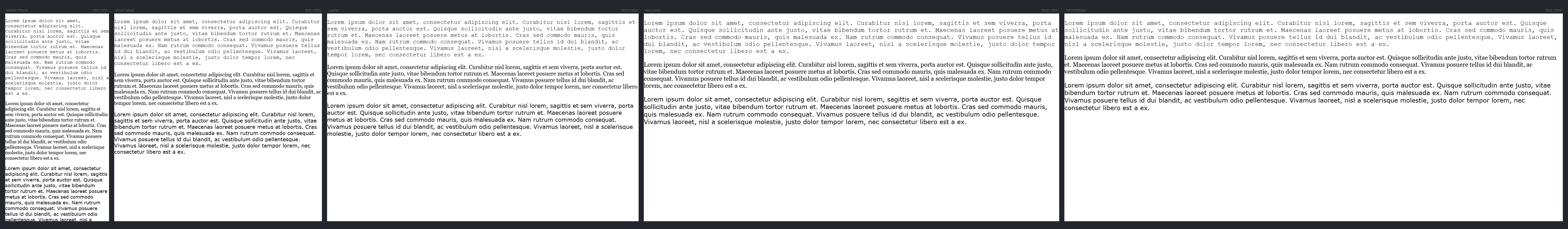
Image for Example 2
    p {
      /* Default: 16px = 1rem */
      font-size: 1rem;

      /* 400px viewport: 18px = 1.125rem */
      @media (min-width: 400px) {
        font-size: 1.125rem;
      }

      /* 800px viewport: 20px = 1.25rem */
      @media (min-width: 800px) {
        font-size: 1.25rem;
      }

      /* 1200px viewport: 22px = 1.375rem */
      @media (min-width: 1200px) {
        font-size: 1.375rem;
      }

      /* 1600px+ viewport: 24px = 1.5rem */
      @media (min-width: 1600px) {
        font-size: 1.5rem;
      }
    }
Code for Example 2
Further Reading
Responsive web design
By Ethan Marcotte
Since its groundbreaking release, Responsive Web Design remains a fundamental resource for anyone working on the web.
What is Fluid Typography?
Fluid typography became possible with the introduction of viewport units in CSS, such as vw (viewport width).
These units allow text to scale based on the size of the browser window, creating a more adaptive experience than fixed pixel values.
So let's recreate our example text by applying 1vw (1% of the viewport width) to the paragraphs.
Example 3
Example 3 uses 1 Viewport unit as the font size for paragraphs.
Go ahead and resize the browser window and you will notice:
- The text resizes smoothly based on the viewport
- The font size is far too small at small screen sizes
- However it does NOT resize when zoomed*
* This is because the text is based on the viewport width regardless of zoom.
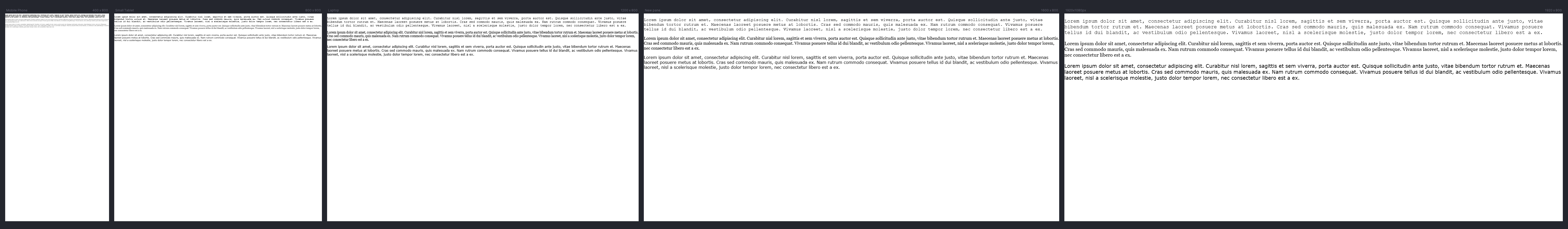
Image for Example 3
    p {
            font-size: 1vw;
    }
Code for Example 3
Further Reading
CSS-only fluid modular type scales
By Trys Mudford
An introduction to Fluid type scales
Learn All 24 "CSS Viewport" Units
By Arafat
There are six different viewport units in CSS with three unique modifiers giving us 24 combinations.
What is Fluid Responsive Typography?
Fluid Responsive Typography introduces CSS mathematical functions such as min(), max(), clamp() and calc() to our toolkit so we can set a minimum, preferred, and maximum size that adapts continuously to the available space, whether that’s the viewport or a container.
While viewport units like vw made fluid typography possible, they have limitations, text can become too small on tiny screens or too large on wide displays and it does not zoom when used on its own.
This is where CSS math functions min(), max(), clamp() and calc() are so useful.
min()
font-size: min(5vw, 2rem);
If 5vw is smaller than 2rem, use 5vw, if 5vw is larger, use 2rem.
max()
font-size: max(1rem, 2vw);
If 2vw is smaller than 1rem, use 1rem, if 2vw is larger, use 2vw.
clamp()
We can combine min() and max() with clamp() e.g. clamp(min, preferred, max), limiting the largest and smallest sizes as with min() and max() with our preferred size in the middle.
font-size: clamp(1rem, 1vw, 1.5rem);
However, zooming causes unpredictable behaviour because the middle value is tied entirely to viewport width.
calc()
Using calc() inside clamp() fixes this by combining a zoom-friendly unit (rem) with a fluid unit (vw) e.g. calc(1rem + 0.5vw)
So now we are back to similar font sizes as Example 2 but without having to write breakpoints for various viewport widths and a smoother transition between sizes.
Example 4
Example 4 using min(), max(), and clamp().
Go ahead and resize the browser window and you will notice:
- The text will never get smaller than 16px regardless how small the screen
- The text will never get larger than 24px regardless how large the screen
- However, the text will resize when zoomed but in a predictable way
- A smooth incrementation of the font size across all viewport widths, here are some examples:
- 400px: 18px (16px + 2px from 0.5% of 400)
- 800px: 20px (16px + 4px from 0.5% of 800)
- 1200px: 22px (16px + 6px from 0.5% of 1200)
- 1600px: 24px (16px + 8px from 0.5% of 1600) - max reached
- 1920px: 24px (clamped at max 1.5rem)

Image for Example 4
    p {
      font-size: clamp(1rem, calc(1rem + 0.5vw), 1.5rem);
    }
Code for Example 4
Further Reading
Modern Fluid Typography with clamp()
By Chris Kirknielsen
You can now define your font to scale with the viewport size with a single line.
Creating Fluid Typography with the CSS clamp() Function
By Daine Mawer
In this article, we’ll dig into how to use the CSS clamp() function to scale the size of text across a range of device sizes.
The Clamp Calculator
Calculate a Fluid Typography Scale
Viewport based Fluid Responsive Typography
We have been using the most basic of web pages with the text going the full width of the screen. Let's now take a look at a more realistic example.
Using a 1600px 12 column CSS grid we will divide this into a 3 | 6 | 3 layout where the 6 column is the main body copy of the text.
Our aim is to get the line length to between 55-75 characters in the 6 column area.
Using viewport units alone works well at our smallest expected size of 400px and our largest restricted size of 1600px.
However, this works less well for many screen sizes in-between, especially when our 3 column area on the right drops below to become a 9 column area. Let's see this in action in our example.
Example 5
Example 5 using viewport units
When the browser is 1600px or larger:
- In the 800px area (6 columns):
- the font size is a maximum 24px
- the longest line length is 70 characters
- In the 400px area (3 columns):
- the longest line length is 35 characters
- the font size is a maximum 24px
When the browser is smaller than 1200px the right 3 column area (the purple area) drops below and becomes a 9 column area:
- In this 1199px area (9 columns):
- the longest line length is 117 characters
- the font size is a maximum 22px
In this example the font sizes AND the layout are relying too heavily on the viewport width rather than the dimensions of the containers.
We could of course use media queries to apply variants of the typography but this would get complex quickly and would not be very dynamic.
In the next section, Container based Fluid Responsive Typography, we will look at how this can be improved using container queries and container query units within clamp.
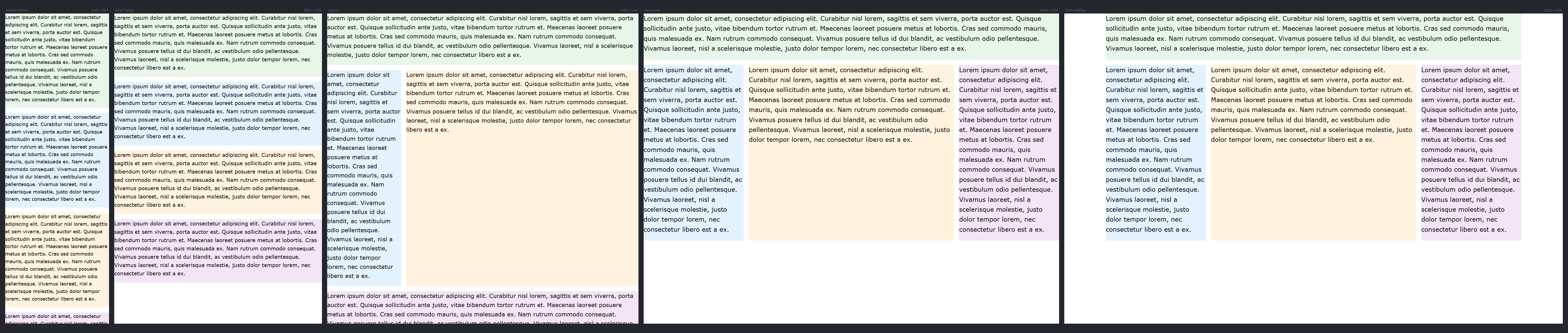
Image for Example 5
    p {
      font-size: clamp(1rem, calc(1rem + 0.5vw), 1.5rem);
    }
Code for Example 5
Further Reading
Utopia
By James Gilyead and Trys Mudford
Fluid type scale calculator
Designing with fluid type scales
By James Gilyead
On a large laptop or desktop display it’s often desirable to use much more dramatic type scales to make the most of the extra space. The question is how to accommodate both screen sizes while respecting everything in between.
Container based Fluid Responsive Typography
In all of our previous examples, we’ve been using viewport width to determine font size. However, with modern CSS, we now have container queries and container query units at our disposal.
This gives us much more control over typography without relying on the width of the entire screen. Instead, we can link the size of our text to the size of the container that holds it.
Why does this matter? Because the width of the display still affects container widths through layout systems like CSS Grid.
By making typography respond to the container rather than the viewport, we create fluid responsive text that adapts to components, not just the whole page.
We could just replace our viewport units vw with container units cqw like so:
.container p {
font-size: clamp(1rem, calc(1rem + 1.25cqw), 1.5rem);
}
But we would still run into sizes getting too big and small as container react to different layouts.
So we add the magic of container queries first declaring all areas as containers:
.container {
container-type: inline-size;
}
We can then set the maximum properties for different areas:
@container (min-width: 800px) {
.container p {
font-size: clamp(1rem, calc(1rem + 1.25cqw), 1.75rem);
}
}
Example 6
Example 6 using min(), max(), clamp() and calc()
The font size, and consequently the line length of each paragraph adapts to the size of its container.
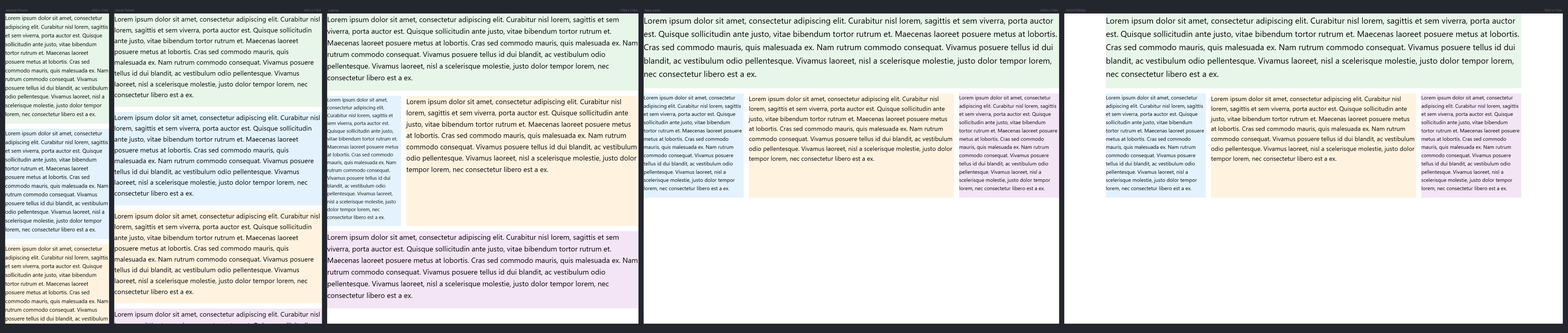
Image for Example 6
On different devices this change is dynamic and whilst the line length for the 9 column area exceeds 80 characters on some lines where there are longer words it is still a lot better than our previous example.
Image from Example 05 for comparison
    /* Default: < 400px container width */
    .container p {
      font-size: clamp(1rem, calc(1rem + 1cqw), 1.25rem);
      line-height: 1.6;
      margin: 0 0 1em 0;
    }

    /* 400px - 800px container width */
    @container (min-width: 400px) {
      .container p {
        font-size: clamp(1rem, calc(1rem + 1.25cqw), 1.5rem);
      }
    }

    /* 800px - 1200px container width */
    @container (min-width: 800px) {
      .container p {
        font-size: clamp(1rem, calc(1rem + 1.25cqw), 1.75rem);
      }
    }

    /* 1200px+ container width */
    @container (min-width: 1200px) {
      .container p {
        font-size: clamp(1rem, calc(1rem + 1.25cqw), 2rem);
      }
    }
Code for Example 6
Further Reading
https://www.oddbird.net/talks/responsive-components/
by Miriam Suzanne
Container Queries, Cascade Layers, Scoped Styles, and Nesting are all aimed at improving the way we write responsive components and design systems.
Container Query Units and Fluid Typography
By Stephanie Eckles
We'll explore three ways to create dynamic fluid typography rules by leveraging container query units and CSS custom properties.
Summary
This article shows how fluid responsive typography transforms the way we design for the modern modular web.
By moving beyond viewport-based scaling and embracing container queries, we gain the power to create flexible, component-driven environments where text adapts beautifully to its context.
This isn’t just about font sizes, it’s about building harmony, readability, and elegance into every part of a responsive design system.
I hope you will give it a try because once you do there is no going back.