Why we love the Umbraco backoffice... and how to make it better

tagged with Backoffice Content

The Umbraco content management experience is one of the best around, so your content team will already be having a great time... but if you're using Umbraco to make custom projects, what else could you be doing to make their lives even better?

In early 2023, we made a commitment that this would be the year that we gave the Shout site a bit of TLC (builder’s house and all that…). The site was running Umbraco 8 and using a design that was a ‘day 1’ rollout… 4 years ago.  

In our defence, we’ve been pretty busy bringing our clients’ digital dreams to life...

We created some design concepts for our key pages, popped a new project into our Umbraco Cloud space, and our dev team migrated our content with uSync.

Then it was over to the content team to make things happen.

Our little content team kept a note as we went through the process of the things we love about Umbraco, and the extra touches that make the difference to us as ‘power users’ of the Umbraco backoffice.

Some of these already exist, either in Umbraco or as packages. Others were quick for our developers to add. The rest have been added to our backlog for later, but might be good ideas for your projects too. 

Read on for some tips to make your content editors lives a dream…
Why we love Umbraco

Let’s get this out of the way up front. I absolutely love Umbraco.

I’ve used plenty of content management systems over the years (Magento, Drupal, WordPress, Kentico and a handful of bespoke platforms) and Umbraco is by far my favourite.

Fast, intuitive, friendly. Users without technical skills can create gorgeous websites, fast. There is enough flexibility to get what you need done, but this is balanced with control so that layout stays neat (making grids with percentage sized elements is a great example of this).

Power users and those with some technical skills can edit source code and tinker with the CSS when needed. I can copy and paste components and create global ones. Brilliant. 

  • The content components are well thought through and we can create pretty much any page layout and style with minimal dev involvement
  • Reusable components can be copied across pages and layouts
  • We can create global content widgets – no more changing a call to action panel in 15 places (and having to remember where those places are)
  • Pretty much everywhere, there is a source editor option for the odd time we want to deploy our CSS skills and adjust something inline
  • There are useful tools like Find & Replace built right into the editor 
  • We can save & preview pages as we build them, and the preview opens in a new tab by default

Balancing flexibility with consistency

One of the amazing things about our Umbraco set up is the range of reusable content components. This lets our content team create pretty much anything we can imagine.

However the other side of this coin is that it can be hard to remember which components do what, or what we’ve used before.

This can, over time, turn into a straggly layout where there are pages that are similar but not identical, or where different editors (or just the same person on a different day) have used a slightly different set of components to achieve the same result.

Having a place to see all the components available, or to see a balanced composition to borrow from, is hugely helpful.

Yes, content editors LOVE being able to craft a bespoke page with exactly the layout we need, but in practice, we’re often moving so quickly that most tasks become a copy-and-paste job.

We created an internal wiki with the settings used to achieve each component look to help with this and to help us stay consistent (and sane) as we add more content.

Help your content editors out by setting up template pages with the ‘best fit’ components and settings, and/or create a wiki to help them remember how to achieve a particular result.

Make everything a rich text editor, and give me a view source option

Most of the time, content editors are using components as they were intended, but on the odd occasion, we want to be able to control very specifically where a line break appears, or to add a bold word.

There's sometimes reluctance from the development team to trust a content team not to break things when giving this kind of control... and that's when it's time to have a conversation. 

We talk to our developers about use cases and why we need control in a certain place - and express that we understand the implications if we do something random and it breaks. In turn we know the developers have our backs, and what sometimes comes across as resistance is because they're trying to protect us from a perceived risk. 

Trust between your development and content teams goes both ways, don't forget to talk to each other. 

Don't give me text I can't format... you can trust me not to break it... honest.

Let us move more of our workflow to the backoffice

In theory content teams will have a content creation workflow, that starts in a specialist tool, goes through drafting and approval, and then makes its way on to the web.

We might even use Umbraco Workflow.

In practice, if a team is small, or a change is trivial and/or urgent, we often content create direct in the backoffice. Some tweaks can make this process happier even for small teams.

Help out your content team. Make sure spellcheck works in your editor (and coach your content teams to turn on their browser’s spellcheck). Think about other tools that could help your teams in their specific context.

Label all the things

We try to work with clients in the project specification stage to understand their content team and their workflow. This can help supercharge the backoffice experience. What tips, comments and reminders might help them best use their toolkit – where could you help them remember what to put in each box?

For example, the most common thing we have to go back and correct is when our blog post descriptions wrap onto a 4th line and break our layout.

Our dev team added an inline reminder to keep blog post descriptions to under 20 words, and this makes sure we don’t break our listing page layout. 

And while we’re on the topic of word counts…

Add word counts and character counts

These can be quick to add and really speed up your content teams.

For example, if you have a field for an SEO description, and you’ve included the advice of how many characters is optimal, if you also add a word/character count to the field, I can remove ‘copy into Word to check the word count’ step from my workflow.

This is something I've added to our own backlog as a result of this latest round of intensive content creation. 

Content locks

This has been floated by large content teams a few times, like here - if you end up being the person who does the pull request for this one, do tweet me and I'll buy you a coffee!

It would be a huge piece of added value to have something to content lock a page, so nobody edits it while I am in there… or worse, so I don’t accidentally overwrite my own changes by working on the same page in multiple tabs.

In the final days of a project, this happens a lot more than one would care to admit.

Accessibility tools in the backoffice

We all know how much accessibility matters now. Content management systems have caught way up on their ‘out of the box’ SEO tools, but they can do more on accessibility.

Giving content editors an easy, and consistent place to add alt text as an image is added to the page and letting them edit the name of an image file in-context can be hugely helpful.

Next time you're building a project, think about whether you can add accessibility checking to the content preview. I haven't had a chance to check out this package yet, but it looks promising. 

Flagging the basics, like heading order, and missing image alt text, direct in the backoffice would save time – and help busy editors remember to include their accessibility best practice as they work. 

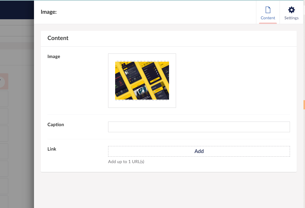
A screen shot showing an image insert function with no alt text editor

I want an alt text editor everywhere I'm inserting an image, to remind me to give it a contextual description

Make components as universal as possible

The copy & paste experience in Umbraco is the best of all the CMS platforms I’ve worked with, but one of the things that tripped us up was not being able to copy some components not in a grid and move them into a grid.

When you're creating or extending components, consider if you can let content editors copy and paste across all contexts. Having worked in dev-adjacent roles all these years, I know there will be a reason why that’s not always possible, but still… if you can make that happen it is golden for content editors.

Let me choose the heading type

If you want to have a well structured page, accessible to screen readers, and content that keeps search engine bots happy, you need to have your heading tags in order.

I’d love it if all the components with a heading let me select in the backoffice whether it was an h1, h2,  etc…

Give it a default by all means, but let your content editors pick an alternative, so they don’t need to go hunting for a different component if they change a page structure or end up missing a heading level. 

Make sure you have SEO catered for in your standard project set up

We always get it right for a client these days – but it wasn’t always part of standard practice…

This is your friendly reminder to make sure your standard briefing and spec process and your standard project setup includes these easy-to-forget steps.

  • Make sure there’s some sort of SEO provision. For most content teams, an SEO package that lets you modify title tags, meta descriptions, add canonical links and redirects is plenty. Advanced teams might need more.
  • Don’t forget the robots.txt file, and have a copy and paste version suitable for generic Umbraco projects ready to go.
  • Make sure your content editor can choose whether a page appears in the sitemap. The use cases for hidden pages include downloadable resources, campaign landing pages, testing pages for the internal team…
  • Decide early whether your site will be at www, or the naked domain, and (help your client) configure the domain accordingly. Also figure out whether you want trailing slash or no trailing slash and set up your project this way from the start.

Conclusion

Content management systems like Umbraco are so powerful and flexible, and those who have been in this game a long time can see the huge progress made.

But just because you’re already using the friendly CMS, doesn’t mean a little bit of thought and planning can’t make life even better for your content editors. 

Take some time to think about – and even better, talk to – the team who will use the tools you create day in and day out and you can create something amazing AND help make sure it stays in great condition over time.